
Welcome~
左のナビを使用してください
Navigation is on the left.
oh no backlog!
Monday, November 18, 2013
This is the moment I realise I have not been posting and I forgot to post about A3 D:Recent lessons (i.e. from the last time I posted) have been about learning to use dreamweaver, then consolidating our FP ideas and stuff. I think my group's FP will be awesome! I mean, it's quite an exciting idea about Joker :P
So, about assignment 3:

It actually didn't turn out how I thought it would be? Remember the parallel storylines I tried to go for? Nope, it actually turned out pretty cluttering. Like when I tried to reading it I found myself trying to read both sides at the same time and basically juggling 2 stories in my head.
Storywise it's not very spectacular either. I still went for the everyone-is-alone idea (mentioned in my previous post about A3 critique), but it didn't really touch me? I'm not very good at emotions, it seems (;*´Д`)ノ
Left the main characters in greyscale/b&w because

Assignment 3 draft
Friday, October 11, 2013
not sure why it appears so dark here o.o
basically I wanted to have 2 parallel contrasting stories showing how alone is like the inescapable ending for all people no matter what they do. you can be super ultra introvert and look at all the popular kids with 324324927 friends who love them and then envy them for it, then feel lonely because you have no friends. or you could be that super ultra popular kid who has 324324927 friends but feels lonely anyway because all those "friendships" are shallow. people have their own lives; people are made selfish. no one will stick around in your life for long. they have their own lives, and ultimately in this long road of life, we have to walk it alone. no one will walk it for us, neither will they walk with us through it. everyone has their own road to walk, alone.
tl;dr? just my thoughts on life so far. it has been the result of all the accumulated "deep thinking" I've done everytime I was down. It made me realise that the only person we have, and can trust is ourselves.
okay but I guess intriguing ideas won't show with bad expression. so I probably have to make quite a lot of changes to this
- Make it look/feel not-branched. my intention was not so much of letting the reader choose one path out of the 2, but more of emphasizing that these paths could go in very different directions but ultimately lead to the same thing. I didnt want them to lead to the same panel because they were different people with different lives, just the same ending. the class suggestion was to make it circular and end both with the same panel. however Vincent also gave me another idea, which was to branch them downwards side by side so readers can see both sides together but still know that they are separate sub-stories. I think I will try that instead :D it feels like it would better fit what I'm going for
- Change style. I guess this is a personal preference. But something just doesn't feel right about it so I will be....REDRAWING EVERYTHING YAY
- and since I'm redoing I might as well add narratives. I was thinking maybe if I show the characters reflecting about their life in their heads it might better portray the feelings of solitude and dejectedness~~ and might also be more relatable to.
A2 final
Friday, September 27, 2013

too many colours @_@ in a bad way. ahhh there goes my bad habit of over de-saturating colours :S
so, i made the panels into a more aligned grid-like structure so perhaps the parallel would be more obvious (first row is what the govt goes, second row is people complaining). but apparently that made it look even more like a propaganda poster oops :x
i guess at least giving the 2 column different colour schemes worked. like, my eyes can automatically detect their relation now. or maybe that's because they're my eyes.
wasnt sure how to present the text in such a weirdly coloured background so....i gave them separate, boring text backgrounds.
the left 2 panel backgrounds are supposed to be smokey (like the smoke is supposed to come up from the fire into the panels) but it's not very obvious now after i overlayed the yellow....
i think the fire is still too attention-catching though.
A2: work in progress

i know i made a post about things i would change for assignment 2. turns out it didnt really go as planned and i'm now stuck with this. problem is that it doesnt look sequential at all :S the fire is already taking the attention away from everywhere and i'm not sure how to fix it without making it look like not-fire.
the words also look super out of place and not where they should be. i actually have no idea how i ended up with this hmmm. trying to salvage the confusing panel sequence by making linked panels of the same colour scheme. hope it works ahhhhhhhh. also random conclusion is random.
you know what this reminds me of? my past social studies/economics essays. disorganised, words everywhere that don't make sense, don't make sense in general, i have no idea what the words i'm writing mean. also, the sudden want to change topic near the end of the essay. maybe because it's 5.30am oops.
hopefully i will wake up tomorrow morning and be enlightened about what i'm doing xD
A2 Critique!
Friday, September 20, 2013
Just had tutorial tonight, and we had small group critiques. Really tired so I'll just summarise and not elaborate. So the few problems that i had to address in my draft:♠ Looks too global, cannot tell it's Singapore
♠ Need to be more obvious
♠ Put more examples where Singaporeans blame the government's incapability despite the situation being out of the government's control
♠ Basically delete bottom part, top part is okay
And a list of roughly what I plan to do:
♠ find maybe 3-4 different such scenarios (flooding, haze, ???, ???)
♠ divide bottom into 3 rows --> situation, what govt has done, complaints
♠ leave the top as it is, with background showing the origin of the situations
Yup that's about it I think! ahh recess week soon! hope i have enough time to make my assignment 2 look decent before submission >.<
A2 draft~
Thursday, September 19, 2013
Last night was the deadline for our assignment 2 draft. Fortunately, I managed to finish my draft on Wednesday night! albeit being slightly (only slightly!) sloppy >w< anyway it's not coloured because.....if i did i would be spending another 10 hours doing this D:
for assignment 2, we were to express our personal concern on the current affairs in Singapore. for me, I've chosen to talk about the flooding in Singapore. I've always thought that these flash floods are not the result of shallow and lousy drainage systems. I've always thought that it was the result of rising sea level, on a global scale, as the ice at the North and South poles continue to melt from the heat caused by global warming. and global warming is in turn, caused by us, the people of the world. It's not strictly a problem of Singapore, but i feel like Singaporeans should not automatically blame the government for lousy drainage system, lying about the frequency of the floods, etc. The government cannot automatically solve all our problems, and sometimes we should do it ourselves instead.
anyway I was inspired by one of our tutorial groupmate's jack and jill comic the other day, where the paper was divided into 2 parts, and the water that spilled in the upper panel fell down to the panel below as rain. i tried to do the same, by using dotted lines as a divided between top nd bottom, so that the seawater may fall down as rain. i think it kindof failed through. somehow it doesnt look too good to me :/
critique session during tonight's tutorial! can't wait to hear my classmates' critiques of my work \(^0^)/
(because honestly i'm rather stuck on what else to do to improve this piece)
Tutorial exercise: Jack and Jill
Tuesday, September 17, 2013

Late post! but this is what I did during our tutorial last last week :P we had half an hour to draw a piece about the classic Jack and Jill nursery rhyme. my first thought was: HALF AN HOUR?! how am I supposed to finish drawing in such a short period of time??? well I rushed part of it and finished the rest at home....
but because of the rush, everything turned out boxy! I don't think creative juices flow when under pressure haha. and perhaps it was part of ego, or my OCD, but I just absolutely HAD to make sure that I drew decently and not have like....stick figures :( it was also hard to recall what I had learnt in the past few weeks.....
well at least I tried. Look, I made Jack fall out of the box! :D
still not satisfactory (in the comic sense) but I guess it's too late to make any major changes to the panels nao :c
A1_final
Saturday, September 7, 2013

my final assignment 1 submission! had to change a lot of it because words werent allowed :x
i also used paint for the blood this time! looks more gory but at the same time even more fake -.- i'm not trained in dramatic makeup, i guess.
anws will post about this week's (thursday) tutorial soon! ahhh i still need to finish and scan it (。_+)\
CE_04 text and images
Thursday, September 5, 2013
Week 4 lecture! We learnt about the use of text in comics, and as usual, we were given a class exercise! This time, it was divided into 2 parts: the individual part, and the group work. (So basically we were given 2 exercises to do this week)Firstly, the individual exercise! Although Scott McCloud had 7 classifications of text in comics, prof thought that having just 4 might be a better idea. So we ended up with the following 4 categories: redundant, contrasting, interdependent, and non-related. We were then supposed to put them into practice. Picture is pretty self-explanatory.

Then we had the group exercise. We were given a short comic page without words, and told to use whatever we had just learnt to add words, in whatever way we wanted.

can you guess what the context is? :P
anyway we didnt add the text to the picture on the spot as group, so I took the chance to be
desperately doing assignment 1
Thursday, August 29, 2013
so my tutorial is tonight. I just submitted my assignment 1 draft yesterday afternoon (I admit to anyhowly photoshopping my pictures together haha), and i only took those pictures the night before (and it was hard because i had to clear this space in the middle of my EXTREMELY cluttered table). And the idea? It'sso here it is:

at first I named it "morbid" but then realised that there was a naming standard to follow (oops!).it's supposed to be about the stages of depression (sad --> crying --> taking drugs/pills --> self-mutilation --> suicide). when i showed it to a friend, she was just like "wtfwtfwtfwtf". i guess this is a bit....not suitable for work haha :x that aside, this clearly needs improvement, but I'm not sure how (i mean, this was the best i could do at that point of time). and that's why we have a critique session during tutorial later, probably.
as usual, rushing out the critiques now (thank god the 3 hour lecture this morning has been cancelled!) and...having some problems because it's hard to find flaws in other people's work, especially when theirs is better than yours :( ohwells.
CE_03 Space-Time continuum
Tuesday, August 27, 2013
Third lecture! This time, the focus of our lecture was manipulation of space and time, and how they could be portrayed differently. And for our class exercise, we got a fun to read (and I must commend the wonderful use of colours, how ever random it may seem in the middle of this sentence) comic by Luke Pearson, aka MumblingIdiot on deviantART. (If you like what you see below do check his other works out because his style is pretty interesting and cute)
We were, of course, given a question to go along with it.

Examine the techniques used for enhancing the time and space continuum used in the comic below:
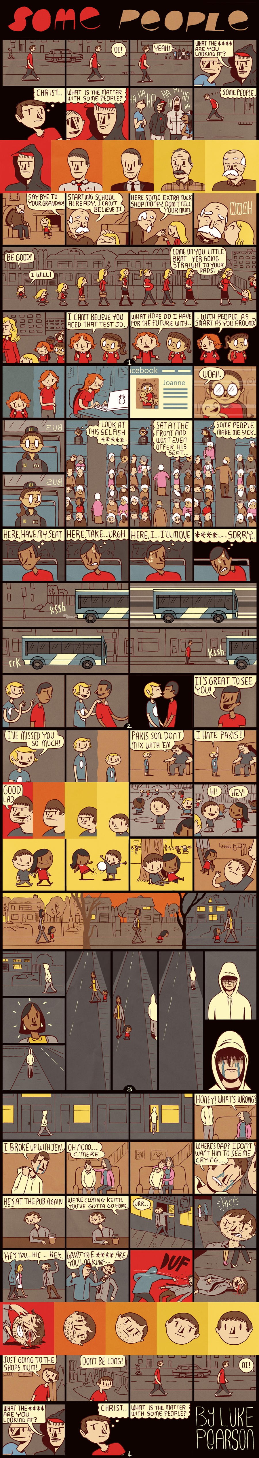
So we broke up into groups and discussed (routine), followed by a class discussion in which every group contributed at least one point. I shall now (try to remember and) list the different points brought up by my group, and also classmates.
1. Use of colour transitions
♠ Probably the most obvious would be the red-yellow colour transitions that portray the character's development and changes through time, at different stages of their lives. It starts with the red background, where each character is angsty, and slowly turns into yellow, showing the calmer, more composed, and younger/older character.
♠ While the above shows the change in 4-5 different stages/frames, there also exists another kind of time transition in the comic. This kind puts the 2 versions of the character (one young, another old) in the same frame, separated by a wavy line in between, and having differently coloured backgrounds. This is used for flashback/fast foward with more emphasis on the event rather than the changes in the character.
2.
♠ Seen in one of the panels near the top. While the background remains the same, the character is portrayed growing up, and growing older, becoming a mother. The environment and routine of walking out of her house has not changed with her growing up. Here we have the progression of time within the same space.
3. Unique and funky gutters
♠ This one is the most interesting (and also raised several debates in class as to what it could have meant). The bare trees in the foreground were used as gutters between frames where time (and space) change occurred. Some people argued that it showed routine, but I don't agree(routine would look more like point 2). I think it's more of a time and space transition emphasizing on a long journey home. The colour change of the sky (and also the gutter-trees!) show the time changes from afternoon to night.
5. Black/Lack of background
♠ Give the feeling of timelessness, a frame frozen in time. Nothing much to elaborate, as this point is mostly felt.
6. Differently sized panels
♠ As opposed to the regular small squares. A few of the longer panels only had a single character in them, emphasizing loneliness, the emptiness of the space, and how small and insignificant the character is relative to the space. I felt that this was more emotion-orientated than space/time though.
Individually, we were also given something else to think and blog about:
Which technique used in "some people" you think is compelling, and why?
Personally, as a visual person, I really love the use of colours in this piece. Naturally, what caught my eye and piqued my interest was the bright red to yellow character transitions, which automatically stood out against the unsaturated brownish hue of the rest of the piece. Upon closer inspection, these transitions had no frame although the contents suggested the existence of one(cropped corners, etc.). It showed the continuity in that period of time, and I liked how the change was portrayed in stages, rather than a direct jump. You automatically knew that it was the same character, but grown up.
And that is all! Other than the fact that we were also kindly reminded to submit our Assignment 1 to the IVLE workbin, which I have not done and have no ideas for D:
CE_02 McCloud's 6 categories of panel-to-panel transitions
Thursday, August 22, 2013
During our second lecture, we learnt about closure, the gutter, and transitions. We were then told about the 6 types of panel-to-panel transitions, that were defined by Scott McCloud. Thereafter, we started on our second class exercise.
Firstly we were given this comic page:

We were supposed to create 6 comic strips of 5 frames each, by putting together a combination of any of the 53 panels given. Each strip was only to have one of the 6 categories of transition. I was grouped with Rabi'a and Ivan, and we came up with the following 6 strips:
Action-to-Action

Subject-to-Subject

Scene-to-Scene

Moment-to-Moment

Non-Sequitur

Aspect-to-Aspect

For aspect-to-aspect, we could not find 5 suitable frames to illustrate it, and thus decided to add our own personal touch (to put it in a nice way).
CE_01 What is Sequential Art?
Wednesday, August 21, 2013
Having missed my first lecture, I have had no introduction to Sequential Art in this module, and have not read any of Scott McCloud's works that has been assigned to the class as readings then. So upon hearing that I would have to define sequential art as my first class exercise, I was totally lost on how to start.But after a few days of thinking, I decided that this "disadvantage" could provide some interesting insights. Thus, I will be defining sequential art twice below; first based on my existing knowledge, followed by any changes after reading McCloud.
se·quenceI've picked out part of the definition of sequence from the Merriam-Webster dictionary, which gives quite a comprehensive idea of what sequential could mean. The main ideas are continuity, order of succession, relationship, and progression.
\sē-kwən(t)s, -ˌkwen(t)s\
2: a continuous or connected series: as
a : an extended series of poems united by a single theme
b : three or more playing cards usually of the same suit in consecutive order of rank
c : a succession of repetitions of a melodic phrase or harmonic pattern each in a new position
f : a succession of related shots or scenes developing a single subject or phase of a film story
3 a : order of succession
b : an arrangement of the tenses of successive verbs in a sentence designed to express a coherent relationship especially between main and subordinate parts
5: continuity of progression
As for art, I believe that there is no fixed definition for it. It varies from person to person, and many people still argue about the boundaries of art and what can/cannot be considered. To me, art is a form of expression. Art has a purpose; it holds the intention of the artist, to portray the beauty in certain ideas, messages, stories, emotions, etc.
Sequential art is thus a series of art pieces put together in a certain order to convey a story, message or idea over the course of a temporal or spatial difference.
Which would bring us to question certain pieces that look like they might be considered as sequential art.

First of all is this picture by David Hocney of his mother (I think). It is a series of photos arranged in a certain order, yes. But what is missing is the story and the intention behind the order. Here, the arrangement of the pieces are for decorative purposes, which makes this merely a mosaic photo.

The next picture is of a man juggling a ball. Although this may look like one picture, it is actually a series of pictures taken over time and overlaid. It conveys a story (albeit a seemingly lame one) happening over a period of time, and thus can be considered as sequential art.

Last but not least, we have this rather morbid photo comic strip of...the brutal murder of strawberries in the blender :( Series? Yes. Order? Yes. Story? Yes. Over a period of time/space? Yes. Definitely sequential art.
After reading chapter 1 of McCloud's unbelievably wordy comic, the only thing I could take away from it was the specific definition he gave for comics:
juxtaposed pictorial and other images in deliberate sequence, intended to convey information and/or to produce an aesthetic response in the viewer.
I couldn't agree more with his definition.
Test post
Tuesday, August 20, 2013
Hello, this is my blog for NM3228 Interactive Sequential Art~about me
Artist.
Yan Ling. 19.
29 June.
Singapore.
NUS SoC.